Introduction
This article is a case study on how to approach an ideation process, how to describe and argument the more promising ideas and how to create a User Story from a raw idea, all while using concrete examples.
I cover the following areas:
- Brainstorming methodology
- Formulating out an idea in more detail
- Dummy backlog creation
- User Story creation from the idea
I don’t cover idea testing and validation techniques (might be a separate article in the future).
This article’s context is Red Planet’s iOS app. Red Planet is a South-East Asian hotel chain whose focus seems to be Gen Z and Millennial leisure travelers who are budget-conscious but have high expectations towards cleanliness, convenience and tech-savviness. For Red Planet’s website, see redplanet.com.
This document is supposed to serve as a work sample, demonstrating by example the approach I take for (parts of) product discovery and product definition. I have no affiliation to Red Planet.
Brainstorming Methodology
When brainstorming new features, it is helpful to set a context in which those features live. For Red Planet, possible context dimensions are:
- User Journey Stage
- Customer Segment
- Business Goal
Each idea should be clearly rooted within one or more context dimensions. I usually follow this approach:
- Create an idea matrix with User Journey and Business Goal dimensions. Depending on the product, sometimes a User Journey / Customer Segment matrix fits better.
- Assign a clear customer segment to each idea
- Validate those ideas with a group of peers or stakeholders. That’s a high-level, qualitative process aiming at utilizing people’s experience.
- Formulate the most promising ideas in more detail
- Design a plan to validate the idea using little dev and ops resources.
First, let’s look at what User Journey, Customer Segments and Business Goals we might work with.
User Journey
For leisure travel, a typical user journey is:
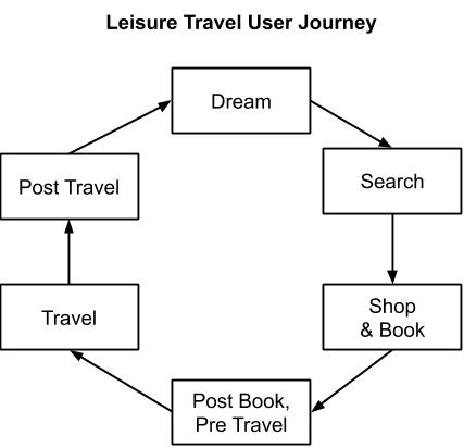
For business travelers it’s essentially a subset, excluding the Dream and parts of the Search and Post Travel stages.
Customer Segments
Judging from Red Planet’s branding, their key target customer segment are leisure travelers in their 20s - 30s, they are budget-conscious but still expect a certain standard.
That’s already rather broad. However, a few customer segments that we might look at are:
- Families
- Budget-conscious Business Travelers
- Retirees
Business Goals/KPIs
Business goals in this context are group-wide objectives that need to be met in the medium term or long (~ 6 month to 2 years). Examples would be:
- Grow number of hotels by 100%
- Expand to a new market
- YoY revenue growth of 100% for PH, TH, JP markets
- Increase order CR by 15%
- … etc.
Idea Matrix
As we now have an idea what kind of context we’re working in, here’s a matrix containing some ideas for new features. I chose User Journey and KPI as dimensions here because I believe that the customer segments are, compared to biz KPIs and user journey, less important for Red Planet. That doesn’t mean we shouldn’t look at customer segments, it’s just that I chose, for this article, not to see them as a primary dimensions.
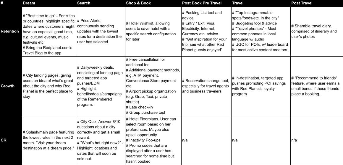
Here’s the link to the spreadsheet. Maybe I’ll change it, so don’t be surprised if the content is not 1:1 the same as in the image. https://docs.google.com/spreadsheets/d/1yjlclx93rPQtyeGImOHlefIcABr5KWaGBTX9RFzZ5Ug/edit?usp=sharing
What follows now is an informal validation of those ideas. Essentially, find clever, experienced people and discuss those ideas. Leverage your peers’ experience and strengths. This can be done in a focus-group like meeting situation, but I prefer to discuss one to one or in small groups (3-5 persons), simply because large groups can form their own dynamic and might be affected by politics and individual agendas more than small groups.
For this article, I assume that such informal validations have happened and that one idea stands out as promising: City Quiz (in the Search / CR cell). Of course there might be more promising ideas to explore further, but for this article one is sufficient.
Narrowing Down
For this article, I’ll focus on one idea: City Quiz. This should give the reader an idea of my thought process. Formulating out more ideas would follow the same pattern.
For the idea of a City Quiz (Search / CR), I will:
- Explore the what, why, who and how
- Draft one user story that aim towards implementing the idea
- Provide a sample product backlog
City Quiz: What, Why, Who, How
What is it?
I imagine a City Quiz feature as a fun game where users answer a couple of, possible rather trivial, questions about a city where Red Planet has a presence. If the user answers enough questions correctly (say 8 /10), she will receive a reward. This reward can then be redeemed when placing a booking or at a later point.
The Quiz should not be too long and achievable within a couple of minutes at most. The individual questions should be interesting and fun trivia about the destination city and Red Planet. Questions should be multiple choice. A sample question could be:
- What is Sapporo famous for? A) Stand-up Paddling B) Winter Sports C) Cuckoo clock manufacturing D) Paella
The quiz should feel informal and casual, it needs to be clear that it’s a fun activity and not a test. Looking at how Buzzfeed does those quizzes gives an indication of the direction I see. Quizzes should be updated in certain intervals so that users find new content from time to time.
The reward should be something that is of low cost for Red Planet but has a monetary value for the user. For example, a free coke from the checkout “convenience store”. Or, 10% extra discount on a POI ticket when bought with the Red Planet loyalty card.
The Quiz entrance should be located in general areas, within the hotel search result or room details pages. Essentially, the Quiz entrance should be located in relation to a destination the user actually wants to visit.
The quiz result should be shareable, both in 1:1 (IM, Text Message, Email) and 1:n (Social) scenarios. The shared artifact should include attractive visuals, an overall positive message about the destination, and should be formulated as an accomplishment of the user who took the quiz (“Look how much I know about Sapporo! Can you keep up?”).
Why do it?
I see the quiz primarily as a CR tool. It’s aimed at keeping a user inside the app if she hasn’t decided to book yet. So, the user needs a small extra “push” to convince them to convert. I believe that such a quiz could be worth exploring because it’s a fun and easy activity that brings the user and her friends and actual, haptic benefit. As such, it can prevent a user from leaving the app, especially if the user is not quite ready to make a decision. Also, doing the quiz makes the app more memorable, especially if the user decides to share the result.
A secondary benefit could be app user growth, because users will share the quiz with their friends. Also, the quiz could be used as a tool to drive traffic from Redplanet.com or marketing campaigns to the app (“Download our app to test your knowledge about Sapporo. A JPY 1000 voucher awaits!”).
I chose this Quiz here because of three reasons:
- I believe it fits into Redplanet’s brand image, which is young, quirky, and casual fun.
- The app is missing CR tools. Only providing means to book a room won’t be convincing enough for many users to place a booking. OTAs and Metasites have a huge inventory that gives users choice. Redplanet can’t do that. To keep up, Redplanet needs to convince users that its offering and brand is unique and fits exactly to the user’s lifestyle (of course more than just lifestyle, but for the Quiz, it’s the lifestyle dimensions).
- It’s also a growth tool. Red Planet seems to be planning to open a couple of new locations till 2021, so they will need tools to drive traffic to the app.
Who is it for?
I see the primary users of this Quiz as users who have not quite decided to book, but are generally willing to stay at Red Planet. Maybe they’re still comparing prices with other platforms, maybe they’re still waiting for the opinion of their travel mates.
In terms of user segments, I see it close to Redplanet’s core customer demographic of 20- and 30 somethings, budget oriented but still expecting quality.
How to do it?
This is difficult to get right without Mockups or UX design and further investigation, so I keep it high-level:
- Quiz needs to be easy to configure for the marketing team: Content, scoring and rewards should be maintainable without dev or ops involvement.
- Quiz needs to have a fun, engaging, energizing UX.
- Quiz needs to have clearly visible and attractive entrances.
- The user should be encouraged to share the quiz result.
- The shared artifact needs to highlight the user’s accomplishment and encourage others to take the Quiz as well.
Backlog
Now that we have an idea of what the quiz is, why we want to do it, who it’s for and how it’s done, we can start breaking the overall feature down into individual user stories and build a backlog. I keep this here on a very high level, but essentially the process is:
- Break down the “What is the quiz” overall feature description into smaller parts.
- Each part being a user story, it should be focused on one usage scenario, helping users in accomplishing tasks, so that user can reach a goal. “As a
, I want to , so that I can ”. - Prioritize (or, for the textbook Scrum practitioners, “order”), the backlog. I use score-based prioritization based on User Value, Frequency of Use and Ease of Development. Note that “Ease of dev” is not the same as Story Points. “Ease of dev” is a preliminary metric used for prioritization. The stories are still voted on by the team in the planning meeting. I’ve written a separate article about how to prioritize a product backlog.
Here’s a sample backlog containing a limited number of stories, so you get an idea of how I approach this topic. This backlog is not supposed to cover 100% of the scope, its aim is to give the reader an idea of the rough scope of each user story.
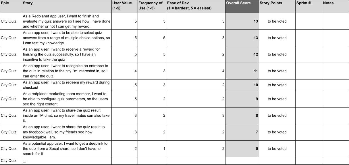
Here’s a link to the Google Doc source. Maybe I’ll change it, so don’t be surprised if the content is not 1:1 the same as in the image.
https://docs.google.com/spreadsheets/d/10Y0fvhbfU75_eB5DCb2jhamSW8IUv2xNVX5n8QyJEaM/edit?usp=sharing
City Quiz User Story: Quiz Submission
The next step for a product owner is to formulate the user stories in more detail. I provide one example of a user story here.
Title: As a potential customer, I want to finish and evaluate my quiz answers so I see how I have done and whether or not I get a reward.
Prerequisites
- User Stories X till Y
Reference Documents:
- Overall feature/epic motivation (see above)
- UX/UI documents
- API documents
- UI style guides
- Coding style guides
User context
- User is on Quiz page inside the app.
- User is signed in.
- User has finished the Quiz from her perspective, that means selected answers for all questions.
User goal
- Submit the quiz
- See score
- Receive reward
Frontend Functional Scope
- A button (or similar) UI element. Triggering this button will submit the quiz answers to the server
- A spinner that indicates that the quiz answers are being processed.
- UI Elements (labels or similar) that indicate when the quiz answers were successfully processed
- For each quiz question, feedback UI elements indicating whether or not the answer was correct
- For incorrect answers, an indication of the correct answer
- Client-side validation of whether or not an answer was selected for all questions
- In case the server failed to respond, an indication that the quiz could not be processed.
- After successful processing, a clear indication of the overall result, and whether the user has passed
- After successful processing, a call-to-action encouraging the user to share (sharing in separate US)
- After successful processing, a clear indication of the reward, and how the user can redeem it.
- Integrate BE API to process quiz
- If the result was negative, the user gets the choice to restart it.
Backend functional scope
- “ProcessQuiz” (or similar) API
- Input: Answers for questions 1 - X
- Output:
- If not all questions have an answer: Error feedback
- For all questions: Correct Yes or No
- For all questions: The correct answer
- Overall result: passed / not passed
- Reward parameters
- Persist quiz result in DB
- Persist reward transaction in DB
Non-functional
- Server-side quiz processing should not take longer than 300 ms.
- Traffic footprint for quiz API request and response should not be larger than X KB
- API rate limit to 5 requests per minute per IP.
- API should be conform with Response Status and Structure standards (which are hopefully defined somewhere).
- The look & feel should be a positive, casual and fun.
- A positive result needs to be communicated as accomplishment.
- A negative result should also be communicated in an upbeat way, e.g. “You’re almost there, check your answers and give it another try.”.
- Localization of labels and feedback messages to JP, TH, ID, PH.
- Unambiguous style: Incorrectly answered questions need to be immediately. identifiable as such, without being accusing. Similar for correctly answered questions, but with a “You did it” feel to it.
- Clicks on Submit-Button needs to be tracked.
- Conversions (bookings) need to be labeled as with/without Quiz, so the quiz impact on the CR can be analyzed (this could also be in a separate US, though).
Acceptance Criteria
- After hitting the “Submit Quiz” button, the user is always kept up-to-date about system status: Processing, Finished processing.
- After the quiz response was processed, the app shows positive/negative feedback for all quiz answers. For negative answers, the correct choice is marked as well.
- The user can retry an unlimited number of times, but only if she didn’t pass before.
- Per user one reward can only be received once. (Reward redemption and management in different US)
- There’s a clear indication that a quiz is ready to be submitted (“clear”: Should be in UX doc)
- In case internet connectivity was interrupted or the request was not successful, there’s a clear error message and the user receives actionable advice on how to successfully submit the quiz.
- The quiz answers are persisted in the DB including all necessary metadata: user id, date, quiz id etc.
- Reward transactions are persisted in the DB.
- If the user exits the app or the page before the response is received, the app will display the correct state on the next visit to the quiz (Quiz load in different US)
Conclusion
In this article, I’ve shown how to get from a very vague situation (“improve the product”) to concrete artifacts that can enter a development sprint. I’ve simplified a lot of course, especially to make up for collaborative brainstorming and empirical product discovery validation. However, the main process described in this article is industry- and product-agnostic and worked well for me in the past.