This article supposed to serve as a work sample, demonstrating the level of detail and structure I suggest for conceptual design critiques. I have no affiliation to Red Planet.
Scope
The scope of this design critique is:
- Analyze how well the app supports users in achieving their goals (Find a fitting hotel and room(s) in the right location at the right time to the right price) and explore possible improvements.
- Analyze how well Red Planet’s business objectives are projected by the app and explore possible improvements. As I don't know the actual business objectives, I take assumptions where needed.
- Explore and suggest improvements for UX processes.
The following subjects are out of scope of this critique:
- Any pages or processes requiring user authentication.
- Any pages or processes requiring an upcoming, ongoing or past booking.
- Payment.
- Performance (because I’m testing from China, and internet speeds are unreliable).
- Multi-language, only checked the English version.
- Android version of the app.
I structure this critique into four sections, corresponding to key areas of the app:
- Hotel search and selection
- Room selection
- Checkout
- Finally, a small section “Missing Essentials” with general content that seems to be missing.
Hotel search and selection
User goals
First, let’s look at the goal of hotel search and selection. From what I’ve learned at working on product in travel, users need to:
- see a realistic price
- for the desired location
- as quickly as possible.
Keeping to those three goals results in the best CTRs to room selection and beyond.
Current situation
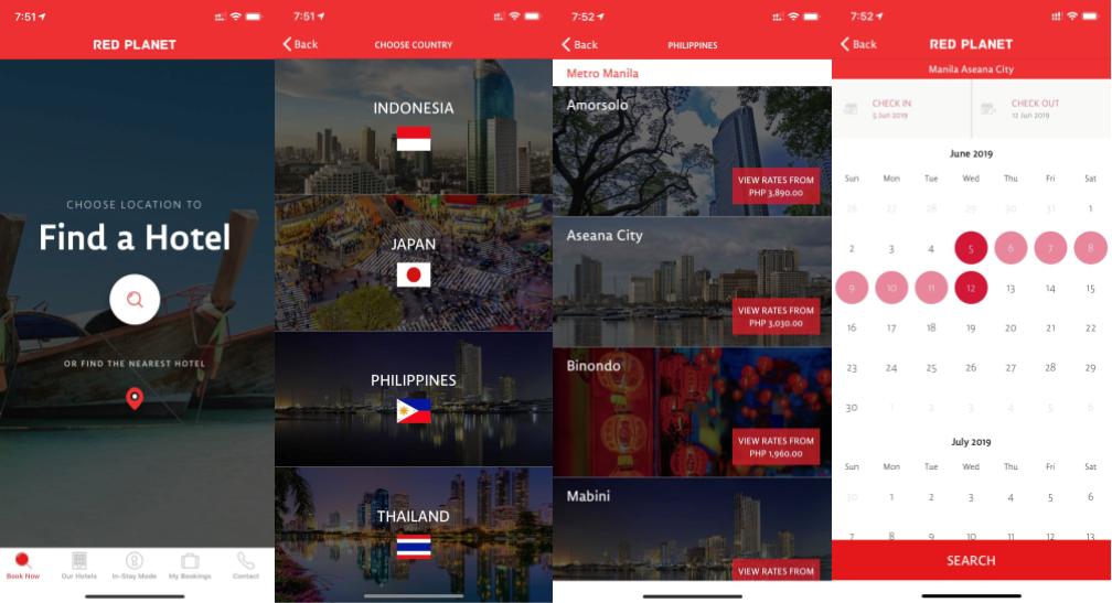
Red Planet’s current hotel search and selection process:
- Open country selection, either through the search button on the main screen, or “Our Hotels” in the navbar
- Select country
- Select location
- Select dates
- Search
Problems
This sequential, screen-by-screen funnel seems to be inefficient in achieving the main goal of getting the user to see a price as quickly as possible. Concretely :
- There are at least 2 screens too many, maybe even three. The process could be streamlined into a much more condensed process. We can optimize towards the “as quickly as possible” goal.
- There is no indication of the geographic location of the hotels. E.g. a user unfamiliar with Manila might not know where “Amorsolo” or “Binondo” are and if she wants to stay there. This opens possibilities for optimization towards the “for the desired location” goal.
- There is no indication of a realistic price until the user arrives at the room selection. This means the user won’t get any incentive (“oh, that’s cheaper than I thought”) or indication (“ok, that’s within my budget”). However, such incentives and indications are vital to convince users to continue down the funnel. I see that at the city selection, there is a “rates from XXX” label. But this is before the date selection. Of course, the concrete booking date can have a huge effect on the actual price. Even only doing a spot-test, I often saw prices 2x as high in the room selection as what I saw on the city selection. Such a big difference reduces customers trust. If you cannot show a realistic price, better don’t show a price at all.
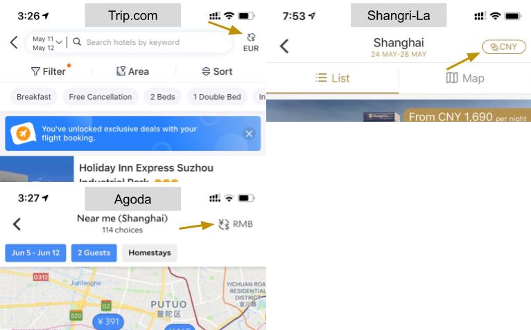
- Currency is not changeable. It seems to always default to the country’s local currency. If a user is unfamiliar with the currency, there is now way to judge the price without a 3rd-party tool. This works against the “realistic price” goal.
- It’s not transparent to the user if a hotel has capacity before executing the search. This might lead to the user having to go back and forth many times in order to find an available slot by trial and error.
Improvement suggestions
Streamline hotel selection process
Problem:
Inefficient search configuration process with too many individual screens.
Context:
User wants to trigger new search
Suggestion:
- Remove individual “Find a Hotel”, “Choose Country”, “Choose Location” pages in favor of one combined search page. Keeping a splash-screen or similar for when the user the app opens is common practice, but only for goals not related to the main funnel (e.g. retention)
- Combine city selection (uneditable textbox), check-in/check-out dates, traveler number and -types, number of rooms into a single search form on this combined search page.
- Hitting City selection text box opens a list page with the city options, grouped by country. The field should be populated with a reasonable default before the user makes her own choice.
- Hitting either date opens a new date-picker page. The current date picker (individually) should work generally. I’d suggest two extension, which I’ll describe a bit further down in section “Date Picker Improvements”.
- A single call-to-action to trigger the search.
- The search should lead the user to a search result page containing a list of hotels in the selected city. Many cities only have one hotel location, but for sake of consistency and testability, I’d suggest to keep the same flow for all cities. This separate search result list page should be designed carefully, but I won’t go into more detail in this document, as there are more than enough reference applications to give us an idea of where to start and what the best practices are. The one point I’d like to make is that the “Remembered” savings should be visible already on the hotel list page, because it’s such a substantial rabatte for very low effort required from the user.
In summary, the new process would be:
- Open App on search page (for branding purposes maybe a a separate main screen, if so then the search is available on the second page after opening the app)
- Configure search: location (city), dates, number/types of travelers, number of rooms
- Search
- Land on hotel list result page
Benefits:
- Be conform with hotel search application industry standard practices. A user using the app for the first time needs to be put into a familiar context. Otherwise she might feel anxious and unsure about using the product. There are established interaction patterns for hotel searches and, before re-inventing the wheel, a product should be designed so users recognize known patterns and behaviors.
- A faster way to provide a realistic price, as city, dates and number of travelers already are enough info to show an accurate lower price boundary to the user. Depending on how fast a price can be retrieved, the price could even be displayed before the user triggers the search. (E.g. label the button “See options from JPY 6,134).
- Make it easier to design a solution for the “at the desired location” goal, since we’re cleaning up the process and don’t need to go into (too many) trade-offs about screen estate and click-funnel.
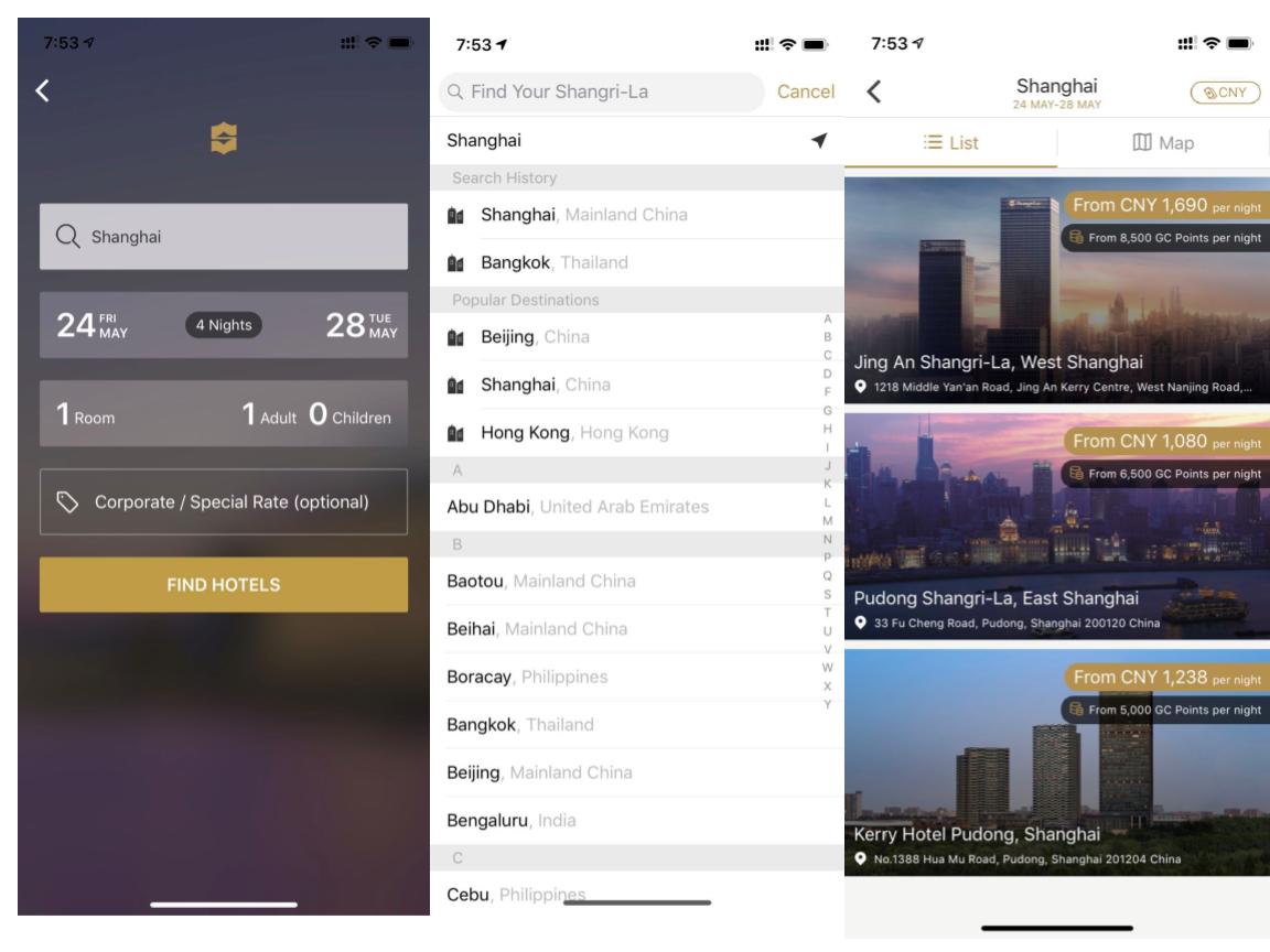
For a redesign, Shangri-La’s app (see below) offers a direction. The target customer segment may be different, but the key user goals are the same. Also, the Shangri-La app has the same business goals: Sell rooms in a limited number of cities, where each city might have one or multiple hotel locations. I’m sure there are other apps to look at, but that’s the one I found matches our scenario best.
Here a few screens of Shangri-La’s app:
Date Picker improvements
Problem:
The current date picker neither indicates prices nor availability. The user is left to find our herself, by trial and error, at which dates offer the best rates and have availability.
Context:
I assume hotel city is known.
Suggestion:
Augment the calendar to show:
- Available, sold/out
- Price per night (or overall price, this is might be worth an experiment)
Benefits:
- Immediately clear to the user when there’s availability
- The price range, and price peaks that the user might want to avoid, are immediately clear.
Google Flights can give guidance on how to display prices inside a calendar:

Improve indication of hotel locations
Problem:
Hotel locations in the cities are not clear to users, it’s difficult to figure out whether or not hotels are in a convenient location or not.
Context:
I assume the user is on a search result page that lists the hotel options for one city (as suggested in chapter “Streamline hotel selection process”. Dates and number of travelers are known. There might be one or multiple hotels to choose from.
Suggestion:
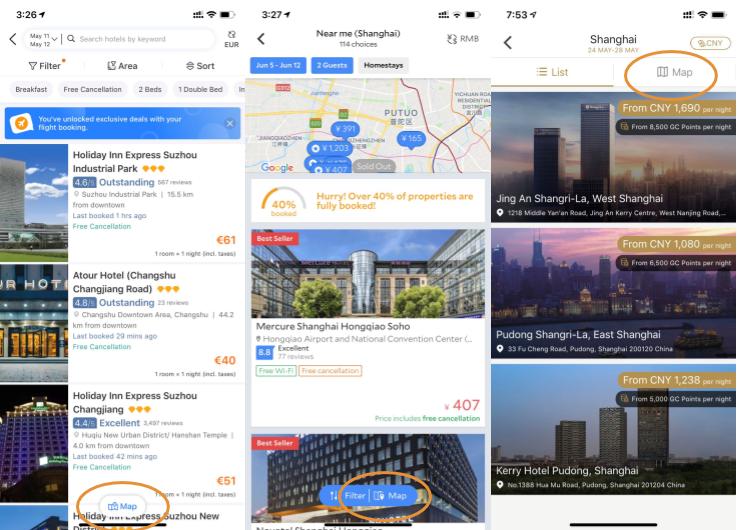
A map-based tool is the obvious choice. We need to think about two topics: The map-tool itself and where to place the entrance.
Map-based tool:
I see that the redplanethotels.com website already has a such a map-based tool. However, I know from experience that implementing a really robust map application for a phone app can be challenging and consume lots of time, even when working inside a Google Maps or Open Street Map sandbox. Therefore, I suggest a two-step approach:
- MVP: Goal is to give the user of the relative location of hotels with respect to each other and to the city’s key POIs. Technically, a static map of the destination city, maybe even just an image. Should contain:
- The hotel locations clearly marked, including lowest prices and hotel names.
- The city’s Key POIs, so the user gets an idea of the hotel’s relative location (“is it easy to reach?”, “is Disneyland nearby?” etc.). Key POIs might be airports, train stations, metro stations (especially close to the hotel), major tourist attractions, shopping districts. I see that on redplanethotels.com there are already indications for each hotel (“22km from Legoland, 11km from airport XY”), but I’d suggest to go one step further and try to mark those POIs on an actual map.
- Individual hotels should be selectable, and lead to a room selection page.
- Maybe basic zoom/pan function, but again, the goal is on keeping technical complexity low.
- More-than-just-minimum viable product: Interactive map. Essentially the same map content as for the MVP, but now inside an interactive Open Street Map or Google Maps context. This would mean that users would have an easier time exploring the details around each hotel’s location while being able to keep an overview about the whole city. Please understand that this approach doesn’t only mean to place pins with the hotel locations onto a Google Map. We need to assume the user is unfamiliar with the city, and as such must also here highlight key POIs, so the user quickly gets an understanding of how well the hotel location fits to her travel plans.
Approaches 1) and 2) are essentially trade-offs between spending time on content creation and technical efforts. In my experience, content creation, especially for a fairly closely defined task as the MVP, can be purchased at affordable rates. But of course this would need to be analyzed further, also towards the technical complexity of a map-based solution.
Entrance:
Placement of the entrance for the hotel-map is crucial, so users actually find it. But it’s also a design element commonly found on hotel search apps. My suggestion would be an entrance that is displayed clearly on the hotel search result list page. Hitting this entrance leads the user to another, full-screen map view page.
Here are three examples (Trip.com, Agoda, Shangri-La):
Benefits:
Providing a map-based view can be considered a standard practice when it comes to hotel searches. It empowers users by giving a clear indication of hotel location relative to other hotels and POIs, so users are able to decide whether or not a location is suitable.
Room selection and upsells
Room selection pages are (by their title in the app):
- Room Details
- Hotel Info
- Convenience Store
User goals
Having arrived at one specific hotel location, the information the user requires to make a choice is already a lot more narrowed down. Also, the choices the user needs to make now are on a much finer granularity. I break it down into a few main questions that users need to answer positively for themselves before continuing:
- Do I like the hotel itself, its location and its amenities?
- Do I find a suitable room option?
- Am I satisfied with the price?
Current situation
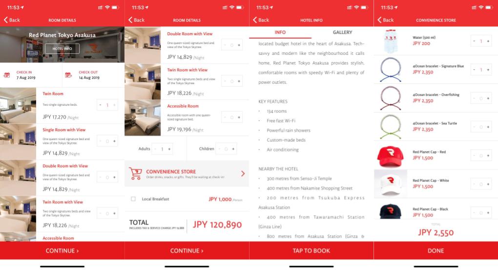
Red Planet’s room selection page currently offers
- Static page with hotel information
- Ability to change dates
- Room selection
- Number of travelers selection
- Upsells/Add-Ons
Problems and suggestions
Compared to the hotel search pages, this page seems a lot more polished. Still, a number of issues caught my eye. As we’re not talking about a whole process here (like for the hotel search), I keep it a bit simpler with the suggestions and add them directly to the problems
Problem: Key information about the hotel policies and facilities seems to be missing:
- Check in/out times
- Accessibility information
- Children and child bed policies
- Cancellation, change and refund policies
- Smoking policies
- Parking situation
- … possibly more items not on top of my head. Needs more investigation.
Suggestion: Those policies need to be communicated transparently to users, otherwise they might feel cheated. In case of cancellation policies, it might even lead to serious consequences of those are not available.
My suggestion would be an extra policy page with entrances both on the room selection and hotel info pages and checkout pages. From my own experience I can tell that as soon as there’s some traffic on the mobile app, cancellation and refunds will be the #1 reason why customers call customer service. The product needs to provide whatever help to users to keep this call-in volume low.
Problem: The selection of the number of travelers at the bottom of the room selection page seems pointless as it’s a constraining factor for price and availability.
Suggestion: Should be specified earlier in the search process (see previous chapter).
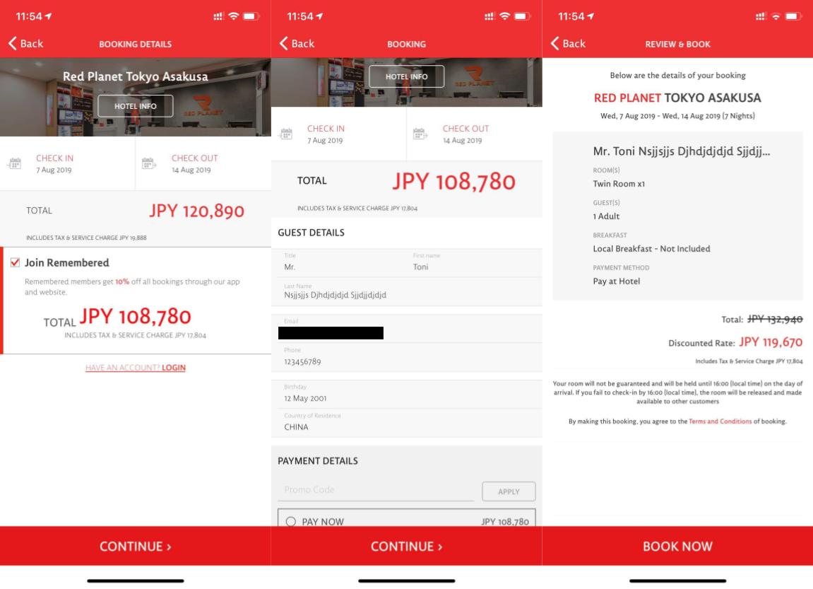
Problem: The price write-up seems to be missing information. The user sees the price per night and the overall price. But the number of nights is missing. Providing a clear and easy-to-follow write-up of how the overall price is constructed is essential in order not to “make the user think”. You don’t want users to pull out their calculators and divide overall price by price per night, so they can make sure there are no hidden costs. You want to assure users everything’s calculated correctly, so users continue to payment without doubts about the pricing structure.
Suggestion: The way Redplanet.com does the write up can give an indication for the app as well. However, I wouldn’t suggest to copy it 1:1 (neither logic nor the layout). I’d especially leave out the “Edit” function (too complex at this location. The write-up is information, not a tool).
Problem: The savings for Remembered members are not visible on the room selection page. But that’s 10% off on all bookings! And it’s free to join.
Suggestion: I suggest to latest display the potential savings on the room selection page. Displaying a 10% lower price tag in earlier stages in the funnel would, in my estimation, lead to a substantial increase in bookings.
Problem: There no images of the rooms except for the default thumbnails (whicher are really small). However, getting an idea of how the room looks like, it’s amenities, cleanliness and available space are key factors when a user tries to decide “is this worth my money?”.
Suggestion: Polished, high-quality images of rooms and facilities are an industry standard. Red Planet has budget prices but wants to maintain a high level of quality. The user needs to be shown images to transport this feeling of quality. It needs to be clear that the images are prototypical for the room category the user is looking at, and not just generic photos.
Problem: While I generally like the hotel information, the information provided is very static and, to be honest, a bit boring. “Custom-made beds” … and now? Why is this good for me? “157 rooms” … that’s great for Red Planet, but will the room I get face a busy street or a construction site? “Free fast Wifi” … I’ve seen places call 1Mpbs Wifi “fast”, be more specific. Similar with the “nearby the hotel” section. “7 km form Ancol Beach” … and that’s supposed to be near?
Suggestion: The hotels (or Red Planet) should decide what the top amenities or qualifiers (e.g. “across the street from Disneyland”) are for each hotel (limited to 2-4) . Those are then shown directly on the room selection page, with a “show more” entrance to the general hotel info page. That give users an immediate idea that the essentials are covered, and maybe even more. The website already does that, but for some reason only on the hotel page, not on the room selection page.
Also, contact info and Taxi card should be directly accessible here.
Problem: Room amenities are nowhere to be found. I found some information on the hotel info pages (“Powerful rain showers”), but that seemed very general. Also, it’s not clear if all rooms are equipped with those general amenities or only more expensive ones. This leaves users to wonder whether they’ll be able to charge their phone, watch TV or take a bath.
Suggestion: First, do what Redplanet.com does and list them for each room. The website uses a popover, one the app an expand/collapse section might make more sense (but those are details). Then, I find the website undersells itself when it comes to amenities. For “Manila Amorsolo”, Redplanet.com tells me there’s a Safety Box and a Television in each room. One page earlier, I read “Tech-savvy rooms are equipped with plenty of power outlets and speedy Wi-Fi so that staying connected is the least of your worries. Plus, cloud-like beds and seriously powerful showers will have you ready for whatever Manila throws your way.”. That’s great! Put it into the amenities for each room. For each room, I’d suggest (only if they actually have that of course) e.g.
- “Super-fast Wifi with ~20Mpbs”
- “Custom-made beds with high-quality mattresses” (the mattress should be highlighted, as that’s what people sleep on)
- “Power and USB outlets all over the room”
- “Air conditioning”
- “Powerful rain showers”
- “40” TV with international channels”
- “Safety Box”
- “Refrigerator” (I haven’t seen many hotel rooms in Asia without a fridge, so I assume they’ve got one)
- “A complimentary bottle of 500ml cooled water”
- Hairdryer
- Kettle
That sounds like a lot more for my money than just “Safety Box and TV”.
Problem: I really like the “convenience store” feature. But: The hotels are offering water for purchase in there. Does that mean there’s no complimentary water in the room? That’s a standard amenity, missing that would put the hotel into a very “budget-y” corner, and I don’t have the impression that’s what Red Planet wants. Also: It’s not clear whether or not the drinks will be cooled.
Suggestion: See above
Problem: People (often) don’t travel alone. But they also don’t sit next to each other when selecting hotel rooms. So how do users ask their travel mates if they’re ok with a room suggestion?
Suggestion: Some kind of sharing component. This is not a trivial feature, as there are many different sharing scenarios. It generally boils down to:
- MVP1: Share text only
- MVP2: Share a screenshot of the room selection
- Just VP: Share a deep link that opens app or website, depending on what device the recipient is using and if the app is installed.
Problem: Taxi card is only available in the local scripture. That’s great for the taxi driver, but the user might feel a little lost.
Suggestion: Always show address in the local script plus the roman transliteration. Also: provide an easy way to copy the address, so users can paste it into their notes, send it to a friend or search it in Apple Maps.
Problem: The “Continue” button is always-on-top at the bottom of the page. This might lead to users missing content below the fold. For example, if there are three room options, the “Local Breakfast” upsell option is not visible (iPhone XR). Also, the user might not see the overall price before continuing.
Suggestion: Either make it clear that there’s more content below the fold, or put the button to the bottom of the page, so the user has to scroll down. An experiment might bring clarity about potential CR impact.
Problem: No testimonials or customer ratings to be found.
Suggestion: Redplanet.com highlights Tripadvisor score and individual reviews. If possible, the app should integrate them in a similar way.
Problem: Currency is not adjustable. Prices are always displayed in the country’s local currency. Users not familiar with the currency have to do the conversion using 3rd party tools.
Suggestion: 1) If transactions themselves can be done in multiple currencies: Provide a way to switch the currency system-wide. 2) If transactions need to be done in the local currency: Offer a way to display prices also in a second currency which the user can choose.
Generally, a common pattern is that the currency-picker is displayed in the app’s top-right corner.
Checkout
Checkout pages are (by their title in the app):
- Booking Details
- Booking
- Review & Book
User goals
When entering the checkout process users have found a suitable hotel and rooms and now want to proceed to payment. Users want a clear summary of the key order parameters: dates, number of nights, room number, room types, number of travelers,
Current situation
The checkout is a two-step process.
- A page that seems aimed at getting users to sign up for the loyalty program
- Personal details and payment page
Problems and suggestions
A number of ways those pages could be optimized:
Problem: Cancellation, change and refund policies are missing, except for a tiny entrance on Review & Book page.
Suggestion: 1) Add an entrance to the general policies page, as described in the previous section. 2) Separately list cancellation, change and refund policies on the “Booking” page.
Problem: It’s unclear how deposit is handled. Usually hotels block a deposit from the credit card, or ask the guest to pay the deposit via cash on check-in. Leaving this information out could lead to unpleasant surprises later on for users.
Suggestion: On Booking Details page, add a note about the hotel’s deposit policy. Maybe only add it to the general deposit page mentioned earlier.
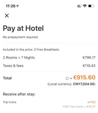
Problem: No comprehensive write-up on “Booking Details” page. The user is left in the dark as to how exactly the individual rates add up to the overall price. This might lead to users feeling suspicious or anxious about using Red Planet.
Suggestion: Clearly add up they key booking parameters and how the overall price is put together. Might be directly displayed or listed within a popover or similar. My suggestion would be to list it in detail on the Booking Details page, and provide an entrance to a Detail-popover on the Booking page.
Here’s a sample of Trip.com’s app, I’d go for a similar direction:
Problem: The structure of the name-form seems strange. Title, First name and Last Name fields seems to be arranged with the aim to save space rather than giving the user a clear path.
Suggestion: I’d suggest to give each field one line. That makes it clear to the user what needs to be filled out by only scanning the page from top to bottom. For Japanese users (maybe other countries as well), Last name usually comes before First name, so an option might be ordering those fields depending on language.
Problem: Users frequently spell their phone numbers and EMail addresses incorrectly. That leads to avoidable call-in volume.
Suggestion: 1) Re-confirm EMail and phone number to users on Review & Book page. 2) Make it clear that Red Planet will send booking confirmations to this EMail, and that customer service will contact the customer via the provided EMail and phone number if necessary. This seems to be common sense, but experience from working on travel products has shown that many customers need those kind of additional hints.
Problem: On “Review & Book” page, the customer name is re-confirmed to the user. However, for long names, the name will be truncated. Especially in Thailand people tend to have long names. This might lead to users being unsure if they typed correctly and returning to the previous page to double-check.
Suggestion: Make sure to provide a way that users can double-check if they spelled their complete name correctly on Review & Book page.
Missing Essentials
The app is missing a number of essential general pages and areas:
- Remembered loyalty program pages, introducing benefits and (independently of the checkout process) encouraging users to create an account.
- General T&C and Privacy Statements. It seems currently those are only accessible from the “Review & Book” page. T&C should be accessible independently from a specific booking process.
- Redplanet.com has a nice blog, the app is missing it.
- Links to social platforms (Instagram, Facebook) are missing.
- Promo & Marketing Campaign pages (I assume Red Planet is already running promos in some form).
As those areas, and with them the content as well, are (mostly) already available within Redplanet.com, it seems like a quick win also integrating those to the app.